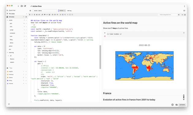
What we will learn?
In this article, we will see how to use open data with Plotlyjs and Streams through Znote in Javascript to explore active fire data around the world.
Active fire data
Thanks to the NASA which make available fires locations and Thermal anomalies with the MODIS system (Moderate-Resolution Imaging Spectroradiometer) onboarded in their two satellites (Aqua and Terra) it is possible to visualize how fires are distributed across the planet.
Where get data?
Last active fire data is available here.
If you want explore the history, it is also possible to ask archive here.
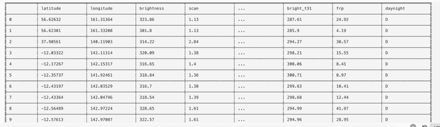
Dataset description
We start previewing the dataset to discover the available columns via a simple print with Danfojs
const df = await dfd.readCSV("https://firms.modaps.eosdis.nasa.gov/data/active_fire/modis-c6.1/csv/MODIS_C6_1_Global_7d.csv");
print(df); // or df.ctypes to list all columns
 Full dataset description is here
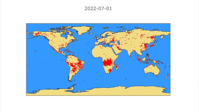
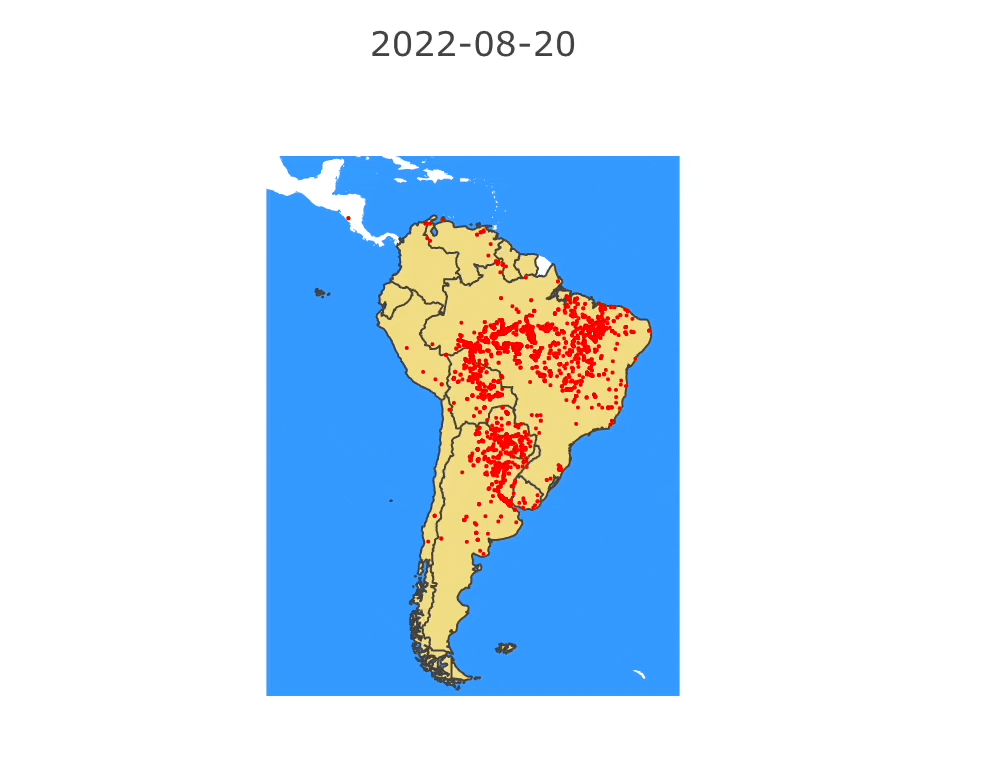
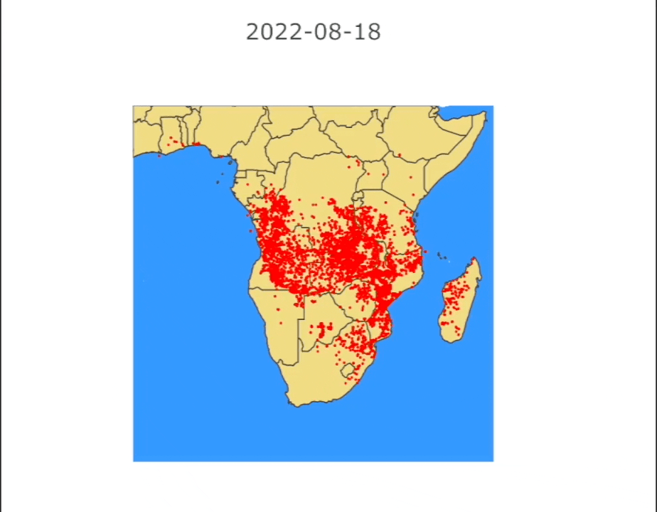
World map of active fires
Each point is a new fire declared per day. It is shocking to see the number of new fires starting every day 😨
The map below scrolls through the months of July and August 2022
How build this map?
const summer2022 = "/Users/alagrede/Desktop/modis-active-fires-7d.csv";

const content = _fs.readFileSync(summer2022, 'utf8'); // read data file

function show(date) {
    // get lat/long fields for date given
    const latLong = content.split('\n')
        .filter(r=>String(r.split(",")[5]).startsWith(date))
        .map(r => [r.split(",")[0], r.split(",")[1]]) // lat/long
    latLong.shift(); // remove header

    var data = [{
        type: 'scattergeo',
        lon: latLong.map(r=>r[1]),
        lat: latLong.map(r=>r[0]),
        marker: {size: 2, color:'red'}, // draw fires
    }];

    var layout = {
        geo: {
            scope: 'world',
            resolution: 50,
            showland: true,
            showocean: true,
        },
        title: date,
    };
    Plotly.newPlot(el, data, layout);
}

// list days between 2 dates (functions used are described at the end of the article)
var daylist = await getDaysArray(new Date("2022-08-18"), new Date("2022-08-24"));

// loop over days
for(const day of daylist) {
    show(day);
    await sleep(500);
}
Refresh data (last 7d) ℹ️
We can now create a function to refresh the data and store it in a file. The last 7d file is directly available online.
const r = await fetch('https://firms.modaps.eosdis.nasa.gov/data/active_fire/modis-c6.1/csv/MODIS_C6_1_Global_7d.csv')
const content = await r.text();
_fs.writeFileSync('/Users/alagrede/Desktop/modis-active-fires-7d.csv', content);
Focus on a country
You can now focus on a specific country of your choice by selecting a center point and changing the map scope.
To find a specific geographical position, open Google map, select a point then copy/paste the latitude/longitude.
You could find the Plotlyjs API description here
var layout = {
    geo: {
        center: {lat: -46.449031, lon: 2.521705}, // France
        projection: {scale: 1.5}, // zoom
        scope: 'europe', // "africa" | "asia" | "europe" | "north america" | "south america" | "usa" | "world"
        resolution: 50,
        showland: true,
        showocean: true,
    },
    title: date,
};
Plotly.newPlot(el, data, layout);
France
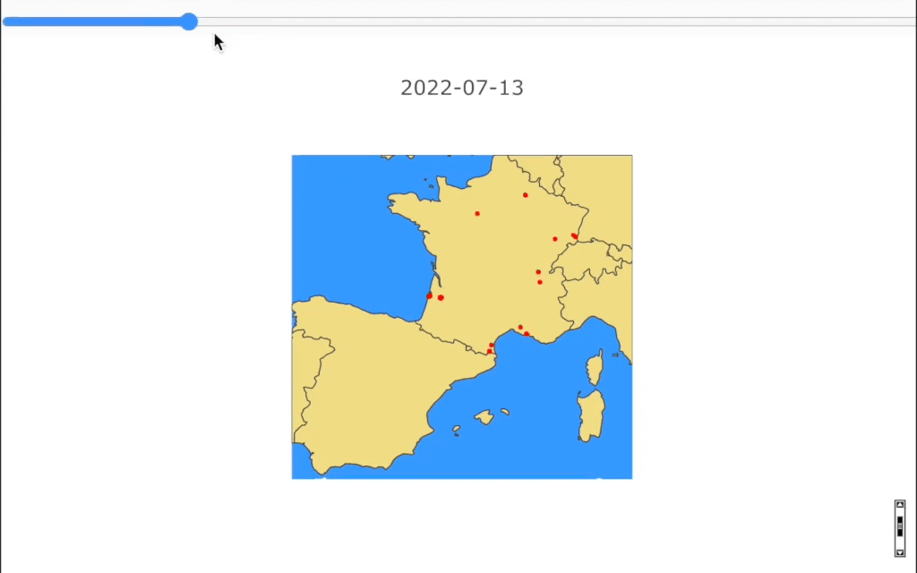
As suggested above, you can add a slider to navigate manually in time
Plotly.newPlot(el+"-myGraph", data, layout);

// add a slider control (min - max - onChange callback)
const slider = await createSlider(0, daylist.length - 1, async function() {
   show(daylist[slider.value]);
   await sleep(200);
});

htmlEl.innerHTML=""; // reset result div
htmlEl.appendChild(slider); // add html slider
var graph = createElement("div"); // add the map into a div
graph.id = el+"-myGraph"; // plotly html id
htmlEl.appendChild(graph); // append map
show(daylist[0]);
Evolution of fires in France since 2000
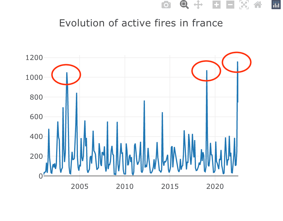
Now that we know where the fires are, it might be interesting to see how the number of fires has changed since 2000. This table reveals exceptional fire activity in 2003 reported in the media due to a massive heat wave in Europe.
2019 a new record Forest fires: in France, in the middle of summer, the area burned is greater than in all of 2019
2022 also a new record... France's unprecedented summer of wildfires, in maps and graphs
// All France fires count (make a ticket to ask history of fires)
const allfires = "/Users/alagrede/Desktop/fire_archive_M-C61_290304.csv";
const content = _fs.readFileSync(allfires, 'utf8');
const activeFires = content.split('\n');
activeFires.shift();
const count = activeFires
    // map to month
    .map(r=>String(r.split(",")[5]).slice(0,7)) // date field like 2008-08
    // map to year
    //.map(r=>String(r.split(",")[5]).slice(0,4)) // date field like 2008
    // group by
    .reduce((total, value) => {
        total[value] = (total[value] || 0) + 1;
        return total;
    }, {});

const data = [{
  y: Object.values(count),
  x: Object.keys(count),
  type: 'scatter'
}];

const layout = {
  title: "Evolution of active fires",
  height: 400,
  width: 500
}

Plotly.newPlot(el, data, layout);
Temperature anomalies
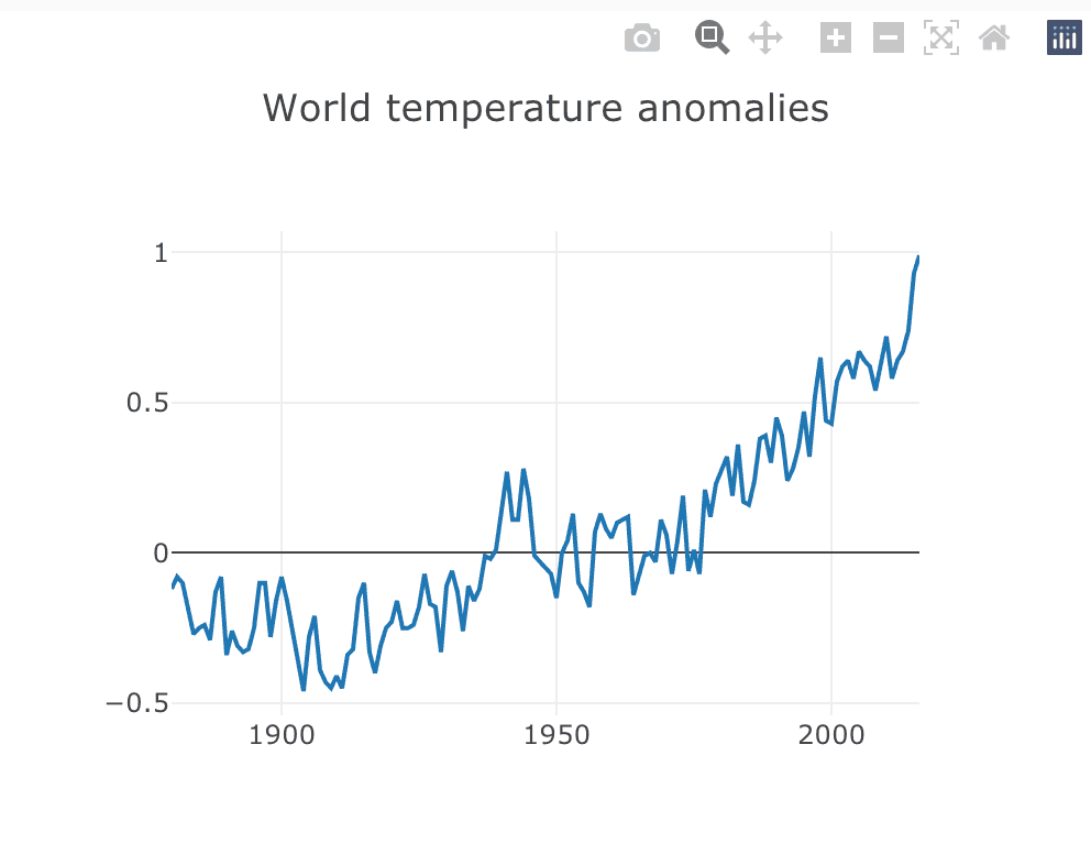
On the temperature side, there is a clear upward trend in temperatures since the 2000s.
This partly explains the increase in fires and why records are frequently broken.
const r = await fetch('https://www.ncei.noaa.gov/access/monitoring/climate-at-a-glance/global/time-series/globe/land_ocean/ytd/12/1880-2016.json')
const json = await r.json();
//printJSON(json);
const result = Object.entries(json.data).map(year => [year[0], year[1]]);

const data = [{
  y: result.map(r=>r[1]),
  x: result.map(r=>r[0]),
  type: 'scatter'
}];

const layout = {
  title: "World temperature anomalies",
  height: 400,
  width: 500
}

Plotly.newPlot(el, data, layout);
World
Unsurprisingly, the world is following the same upward trend.
Others continents
Compared to Europe, the number of new fires declared on the African and South American continents is literally frightening... 😅
functions used in scripts
async function getDaysArray(start, end) {
    for(var arr=[],dt=new Date(start); dt<=new Date(end); dt.setDate(dt.getDate()+1)){
        arr.push(new Date(dt).toISOString().slice(0,10));
    }
    return arr;
}
async function sleep(time) {
  await new Promise(r => setTimeout(r, time));
}
async function createSlider(min, max, callback) {
  var slider = createElement('input');
  slider.type = 'range';
  slider.min = min;
  slider.max = max;
  slider.value = 0;
  slider.step = 1;
  slider.style.marginLeft = "0px"
  slider.style.width = "100%"
  slider.addEventListener('input', callback, false);
  return slider;
}
Go further
For those who want to take this example further, the entire Javascript notebook is available in my Github repo.
To facilitate the use of this data, this example was made with the interactive Znote app.